The past little while, I have been slowly getting all of my photograms corrected and fixed to put them up in a gallery on my website (which I hope to get done this weekend). While I was trying to fix one that was, and still is, nearly impossible to match to the original print, I started playing around with levels and curves and hue and saturation, and other tools in photoshop, and I came up with these:
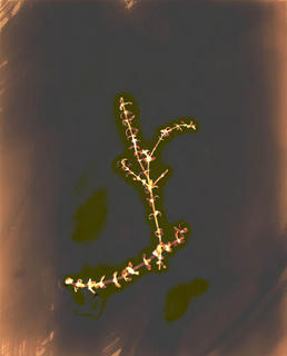
I played around with the curves on this one
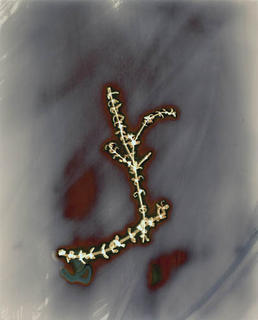
 On this one I just applied auto color
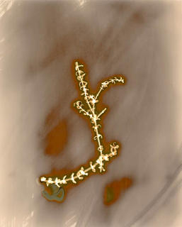
 This one is the original scan, which doesn't at all match the original print (I've finally decided I'm going to have to rescan this to get it to match the original print)
 After playing around like this, I think this could be a way to take Burchfield's idea one more step. But I almost feel like it's a cheap way to be different. And, there are some that I just can't bring myself to alter so dramatically; the original colors are too beautiful to not try to preserve.
I played around with the curves on this one
 On this one I just applied auto color
 This one is the original scan, which doesn't at all match the original print (I've finally decided I'm going to have to rescan this to get it to match the original print)
 After playing around like this, I think this could be a way to take Burchfield's idea one more step. But I almost feel like it's a cheap way to be different. And, there are some that I just can't bring myself to alter so dramatically; the original colors are too beautiful to not try to preserve.