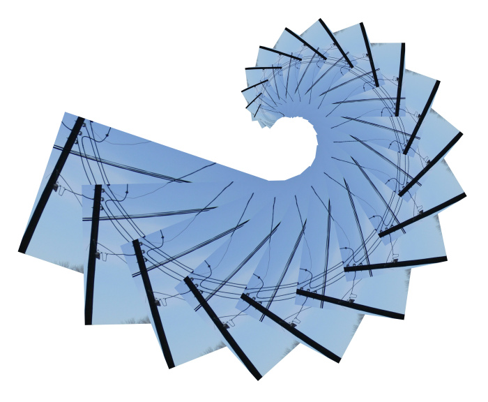
A little while ago LensCulture announced their 2017 Exposure Award winners. Among the superb photographers represented were a pair who, for the last 12 years, have been working collaboratively. Ground Truth: Corona Landmarks by Julie Anand and Damon Sauer immediately resonated deeply in me, and the images and concepts behind this body of work have been bouncing around my mind ever since.
I admit to feeling a small amount of jealousy when I first saw the photographs. It was another of those "I wish I'd thought of that!" moments. But I'm glad those moments occur, because they are, in the end, motivating. They make me think about my own work in new ways; how to look at the world in new ways.
I emailed the artists with several questions about the Ground Truth work, and I was pleased to receive a quick response from Julie. Here is our exchange:
Andy Duncan: Can you explain a little about the origins and inspiration for this project and how it came to be?
Julie Anand: Damon read an article conjecturing about strange marks in the Gobi desert hypothesized to be used for satellites and it linked to a single site in the Arizona desert. We made a field trip and eventually found more and eventually Damon mapped the entire system using Google Earth. Meanwhile we did research and found that in 2004 a pilot had discovered them from above and linked them to the Corona project. So we started exploring them photographically. Eventually we started using a 16ft boom. At first they were pretty straight documents and we went around photographing markers that way. Then we got a grant for a new camera and had to redo all our work, so we rethought it and turned them into vertical landscapes. We did that for a while. Finally, we added the layer of looking at what satellites are present now. It took a couple of years for us to develop this methodology. It wasn’t our first draft by any means.
AD: How long have you been working on the project, and how much longer do you think it'll take before you consider it to be finished?
JA: We’ve been working on it for about three years, and as I mentioned above, we went through several different versions of how to explore these markers. Our website isn’t up to date (we have a fresh batch of images in progress right now), and we’re still negotiating what it will mean to be finished.
AD: How do the paths of the satellites influence the composition of the photograph? And visa versa? Or do they?
JA: The satellite paths are a chance operation with respect to the photographs. We have no idea what they will look like when we make our images.
AD: Do you make the photograph and then look up and superimpose the satellite paths, or look at the paths first in your tracking software and then make a photograph with the satellites' paths in mind for the composition?
JA: The photograph comes first and that gives us the data for plugging into the software to determine the satellite paths.
AD: How many photographs do you make at each marker?
JA: We usually walk around and decide what would make the most interesting vantage and make a couple of different versions. Each final image we make is stitched from about 5 images. It’s a fairly big set up with two tripods, sandbags, 16ft boom, tethered laptop etc…precisely measured…so we’re not very “casual” about moving around, but we know that getting to the sites takes a lot of resources and energy so we try to give ourselves options in the field.
AD: How many markers have you photographed so far? Are they all still extant? Looking at the map on the website, I see some blue marks and some green marks. Can you explain the significance of the two? Am I correct in assuming that the green marks indicate the marker at that location is missing for whatever reason?
JA: We have a fresh batch we’re working on right now. When we are through with those, we should be at around 40 completed images. The map is an important part of the project that represents significant research. We plan to show the map in the exhibitions with our images. The map has several layers of things going on. Green marks are ones in which there is no photographic record of any kind available for the site. Otherwise, light colored crosses reveal our images, or dark blue crosses have embedded color Google Earth historic images or black and white aerial images that Damon researched if it wasn’t on Google Earth at all. But just because we’ve researched a historic aerial or historic Google Earth image doesn’t mean the marker is there today. I created a spreadsheet of all the sites and about 100 markers have been removed.
AD: Are there any markers that you've decided to not photograph because of lack of visual interest? Or has there been an additional purpose of cataloging each marker?
JA: We haven’t edited out sites at this point because we’re never quite sure what they will look like once the satellite map is created. Since that’s a chance operation, sometimes even very plain ground views produce stunning line drawings. We’re still deciding about what we think “complete” should mean for this project. But intuitively we feel we’re not finished, so we keep working. We have other things we want to try as a parallel practice to the photographic typology.
AD: Are these markers still used by the Air Force and CIA? If there are some missing, I can't think that they are still used, otherwise they would be better maintained. Also, if some are missing, and this grid is no longer used for satellite calibration, how are satellites calibrated today? Is there a new grid of markers somewhere to serve this purpose? Or is that information possibly classified?
JA: The project was decommissioned in 1972 and the markers have been decaying in the desert ever since. The Corona project was declassified in the 1990’s. We have an appointment to talk with a satellite scientist to find out more about how these were used, to help us interpret patterns in our sky maps we are creating, and to learn more about contemporary calibration systems.
AD: How did the government acquire the land, with the Corona Project being a secret joint program? Was the land bought from the then owners of that land?
JA: The Army Map Service leased the land in 100 foot parcels from land owners...There is a lot of speculative stuff online and we need an actual historian to do some work on this field. We are looking for a historian collaborator.
I'd like to thank Julie here on the blog for taking the time to answer my questions. After reading her answers, I was even more excited about her and Damon's project! I can't wait to see how it progresses! Head on over to their web site at 2cirlcles.org to see the whole collections of photographs. Read their statement. Check out the map, and don't miss the Process video! I love seeing the "behind the scenes" of how artists make their work, and this video really shows how much work goes into making just a single photograph of these landmarks.
I found a Youtube video of a presentation Julie gave in 2015 at WSU. It's worth watching if you've got a little extra time to spare. You can also check out an article about the Julie and Damon's work on Wired Magazine: These Concrete Relics in Arizona Helped Satellites Spy on the Soviets—Wired Magazine
Calibration Mark X47 with Satellites
Calibration Mark AC47 with Satellites
Calibration Mark AE48 with Satellites
Calibration Mark AC48 with Satellites
